The Problem
How might we help students in New York City discover and utilize ideal study spaces equipped with the resources they need while also motivating them to actively engage in these study spaces?
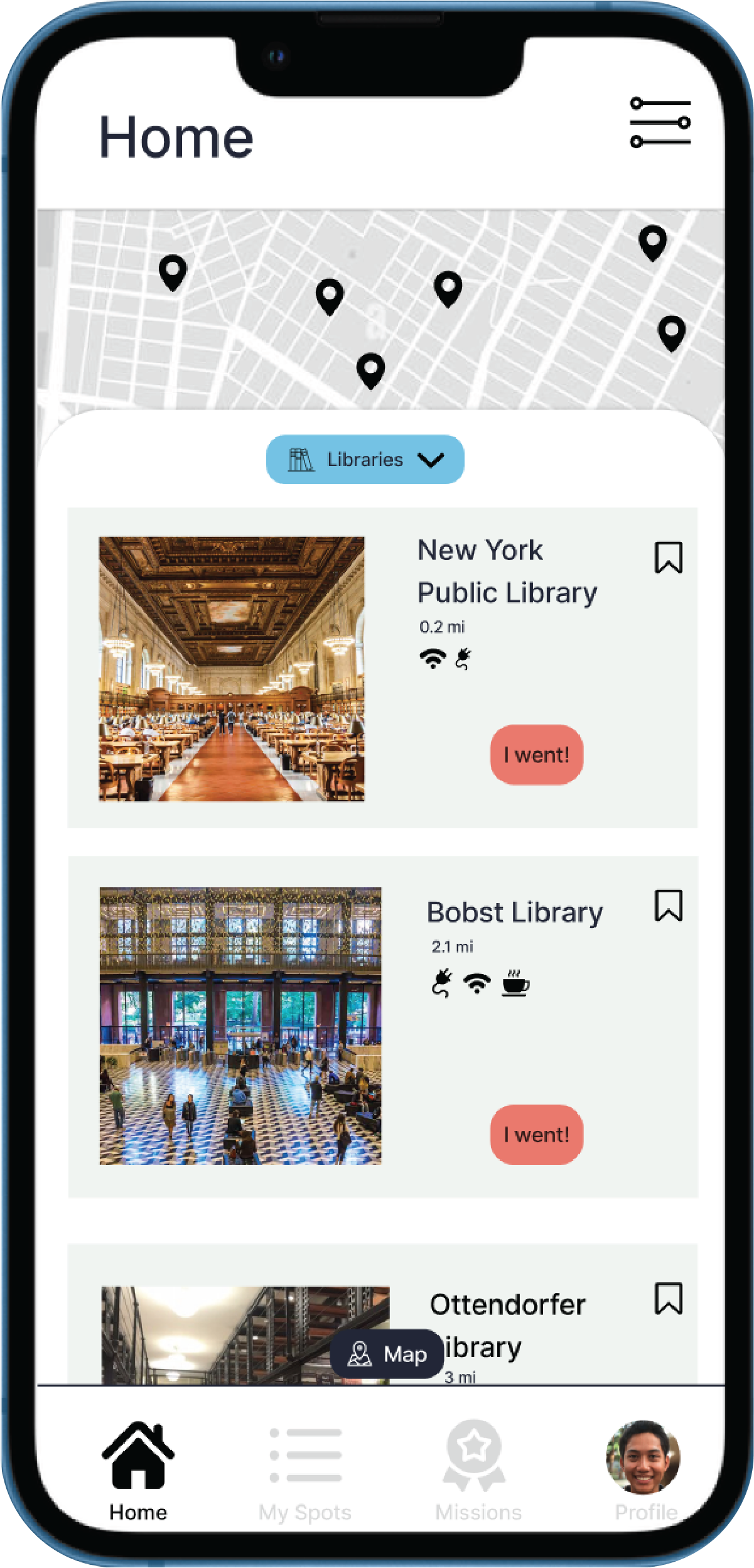
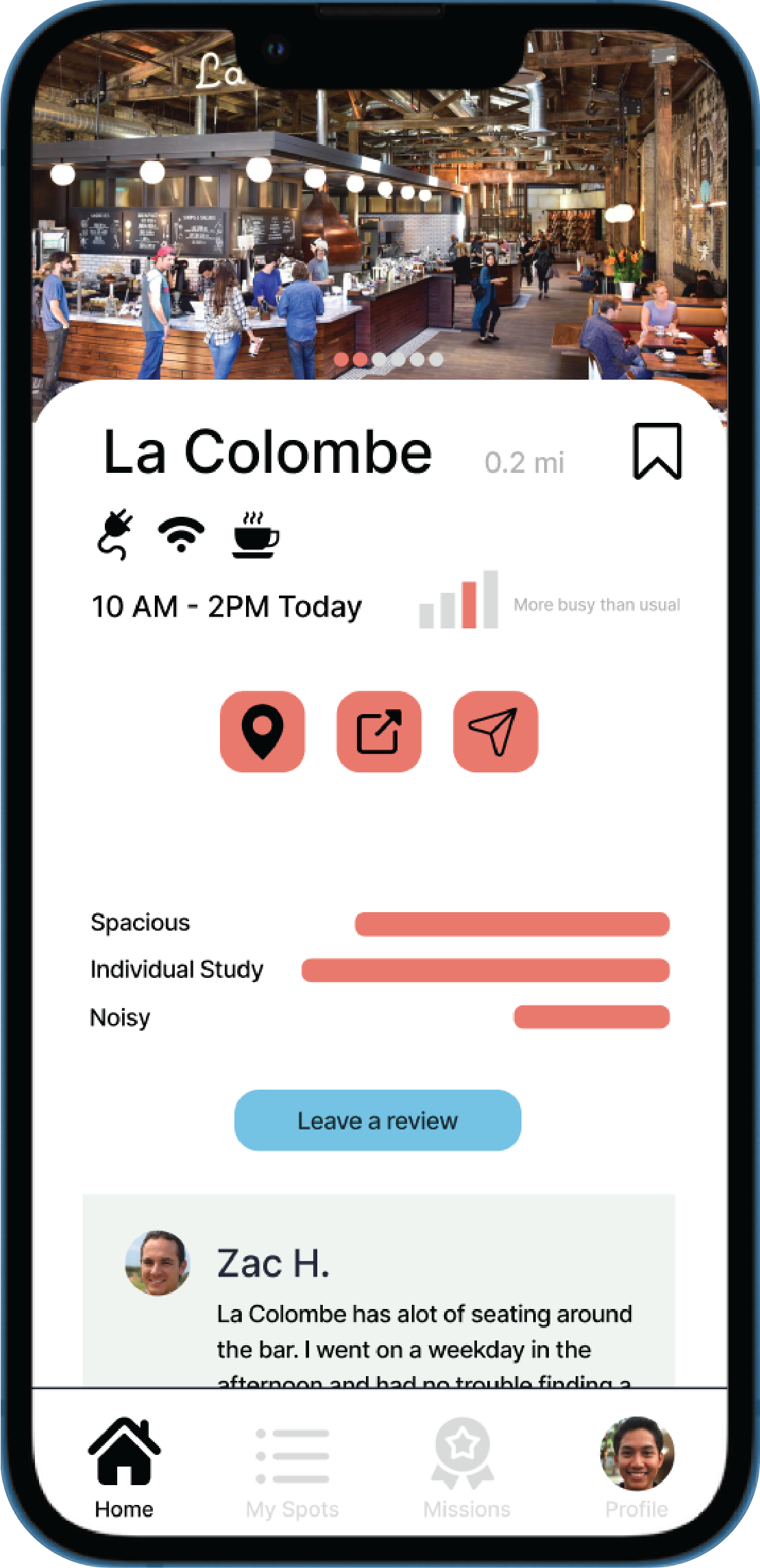
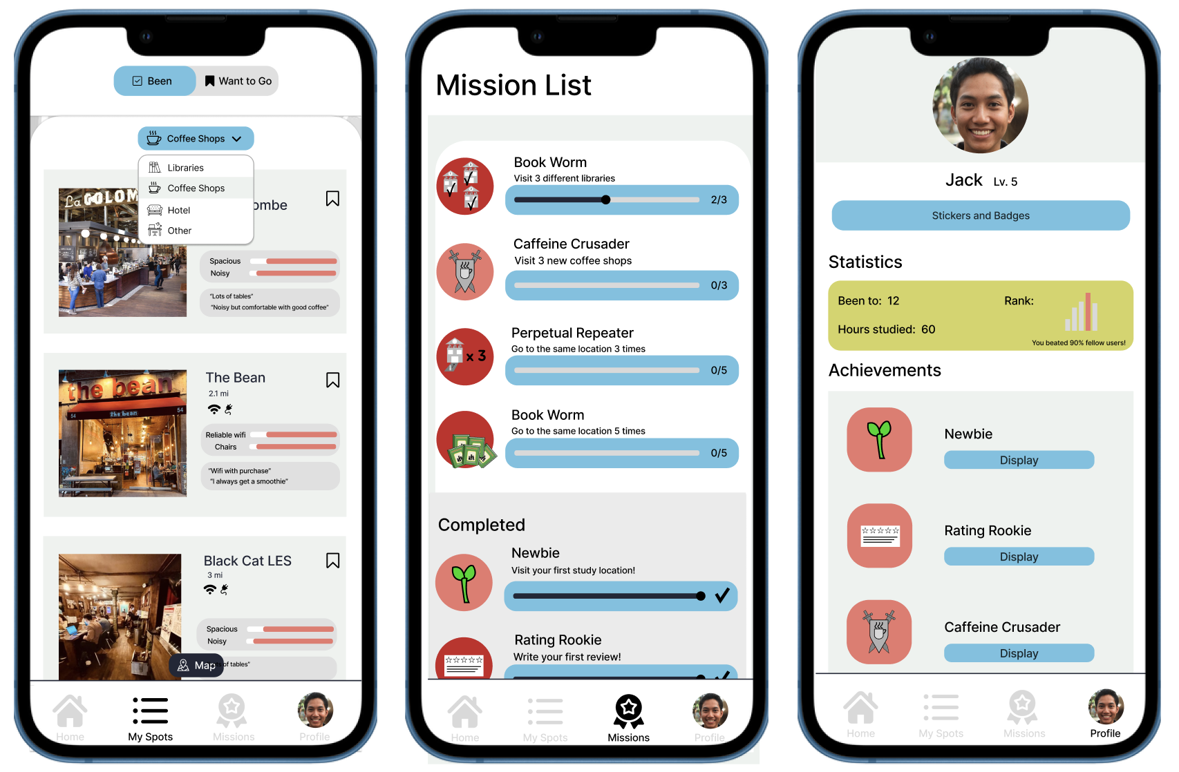
StudySphere is a mobile application designed to help college students in New York City discover and utilize their ideal study spaces.
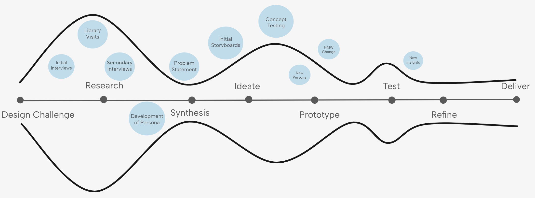
This was developed as part of a semester-long research project within a User Experience class at NYU, taught by Rebecca Blum. Our exploration and ideation were sparked by a compelling prompt: Your clients, a tech start-up looking to give back, in partnership with the city of New York, are looking for your help in improving the library experience.
UX Research
Prototyping & Testing
Jaden Mansfield
Hazel He
Noah Lee
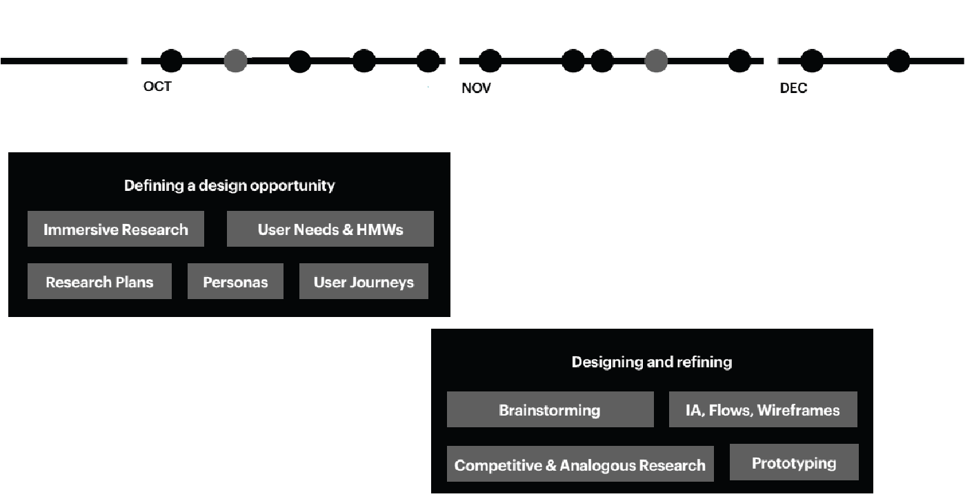
12 Weeks
How might we help students in New York City discover and utilize ideal study spaces equipped with the resources they need while also motivating them to actively engage in these study spaces?
Design a mobile app that allows students in NYC to locate ideal study spaces equipped with the resources they need.
Integrate features to motivate and reward users for trying out new study locations.
We started this project from our own experiences. As students residing, studying, and working in New York City, we frequently encounter challenges in finding conducive work environments. It is often impossible to locate spaces with dependable Wi-Fi and accessible power outlets online.
By consolidating all available study spaces within the city onto a single platform, students can effortlessly discover an ideal workspace tailored to their preferences.
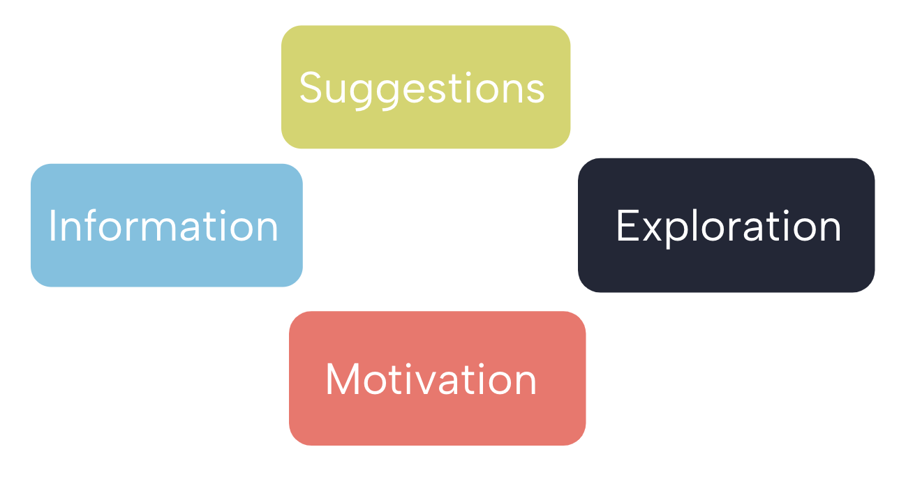
Key Takeaways:


Jack is a full-time student, majoring in Game Design in New York City. He moved to the city 2 years ago for college, and is still discovering new things about the city everyday. If he is not studying at home, he goes to his university’s library, because he knows they have comfortable chairs, reliable wifi, and outlets. Jack wants to try new places to study because he feels the most productive when he is around other people, but doesn't know where to go.

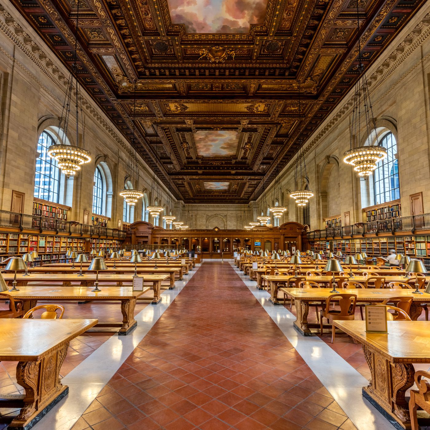
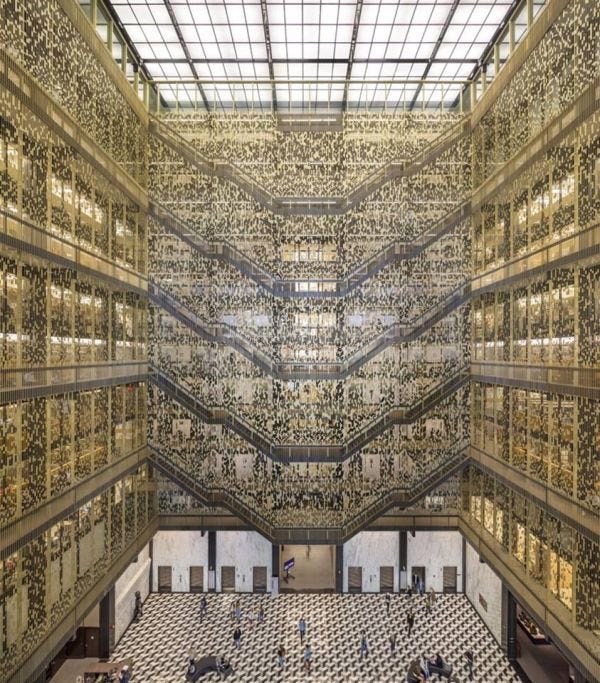
Our team visited NYU's Bobst Library and The New York Public Library.


In this first iteration of our design, we were focused on both helping users find libraries and other study spaces as well as improving the booking process of study rooms within libraries.
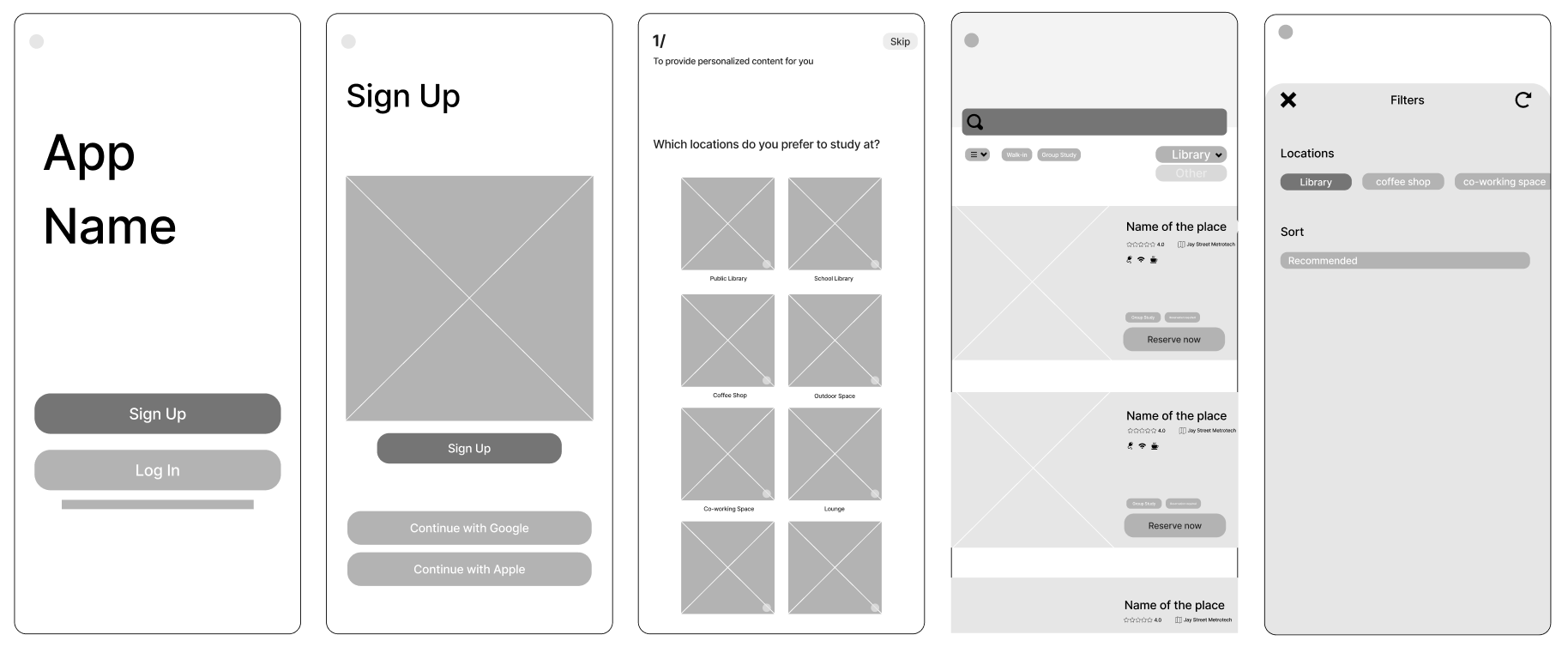
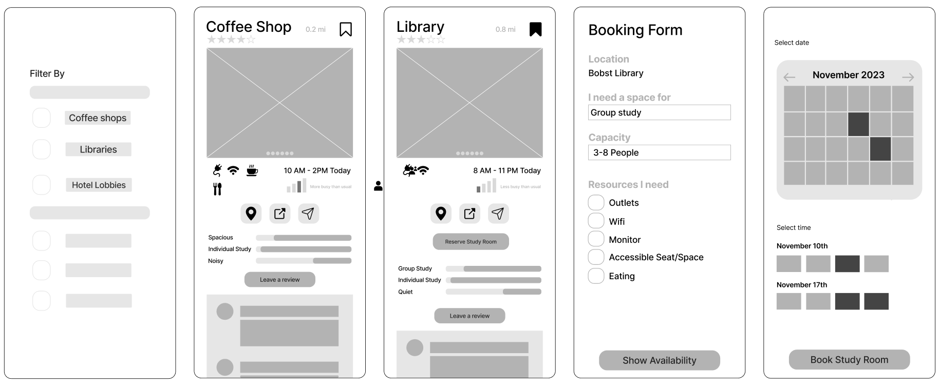
We received feedback on our initial ideas from 5 working designers.
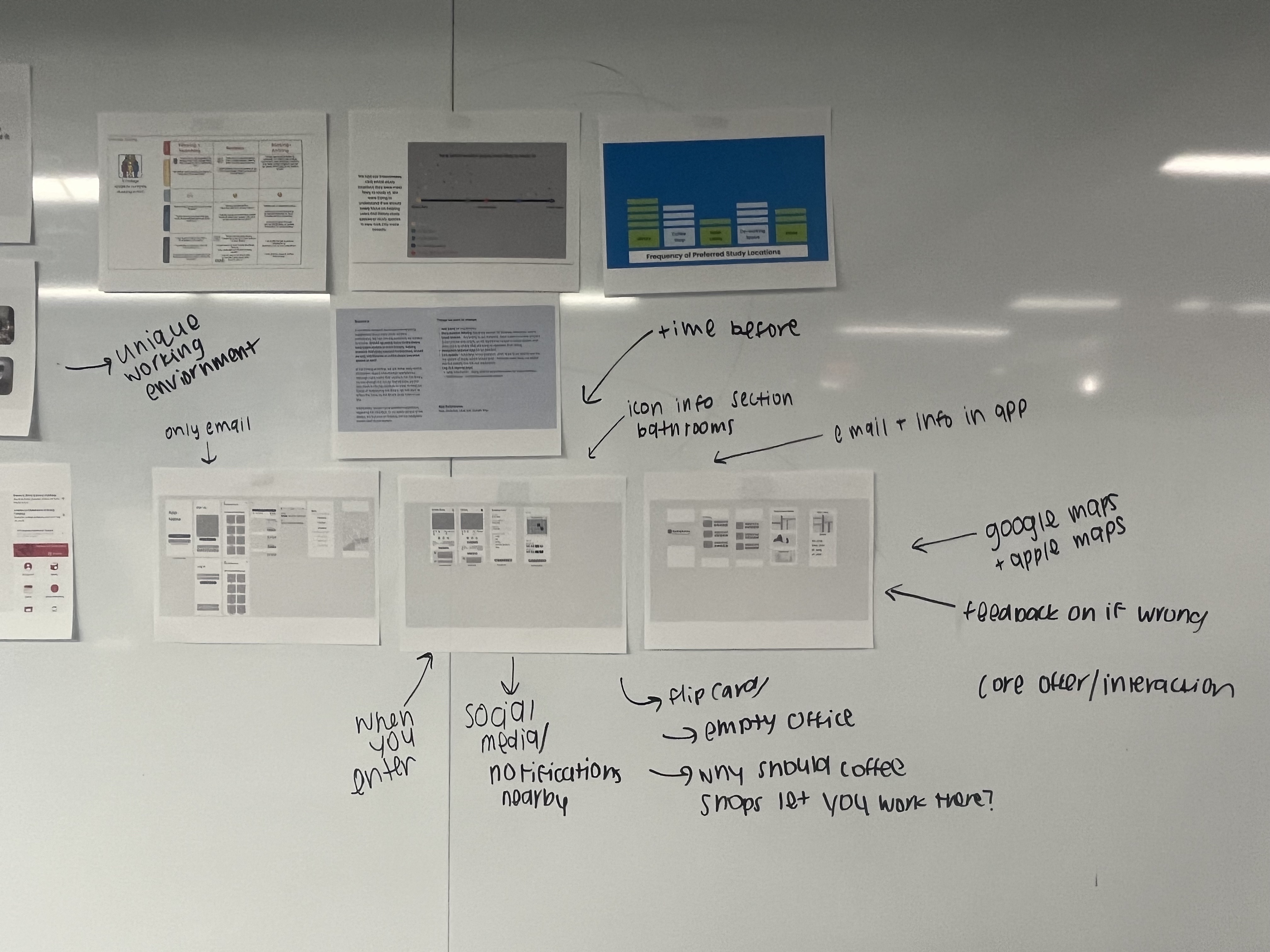
Takeaways:

